Redbubble Case study
Redbubble is an online print-on-demand marketplace catering to independent creatives (called “artists” internally). They are one of Australia’s biggest online businesses and manage thousands of transactions every day.
After a couple months supporting a rebrand I settled in the Marketplace team as the Product Designer.
Context
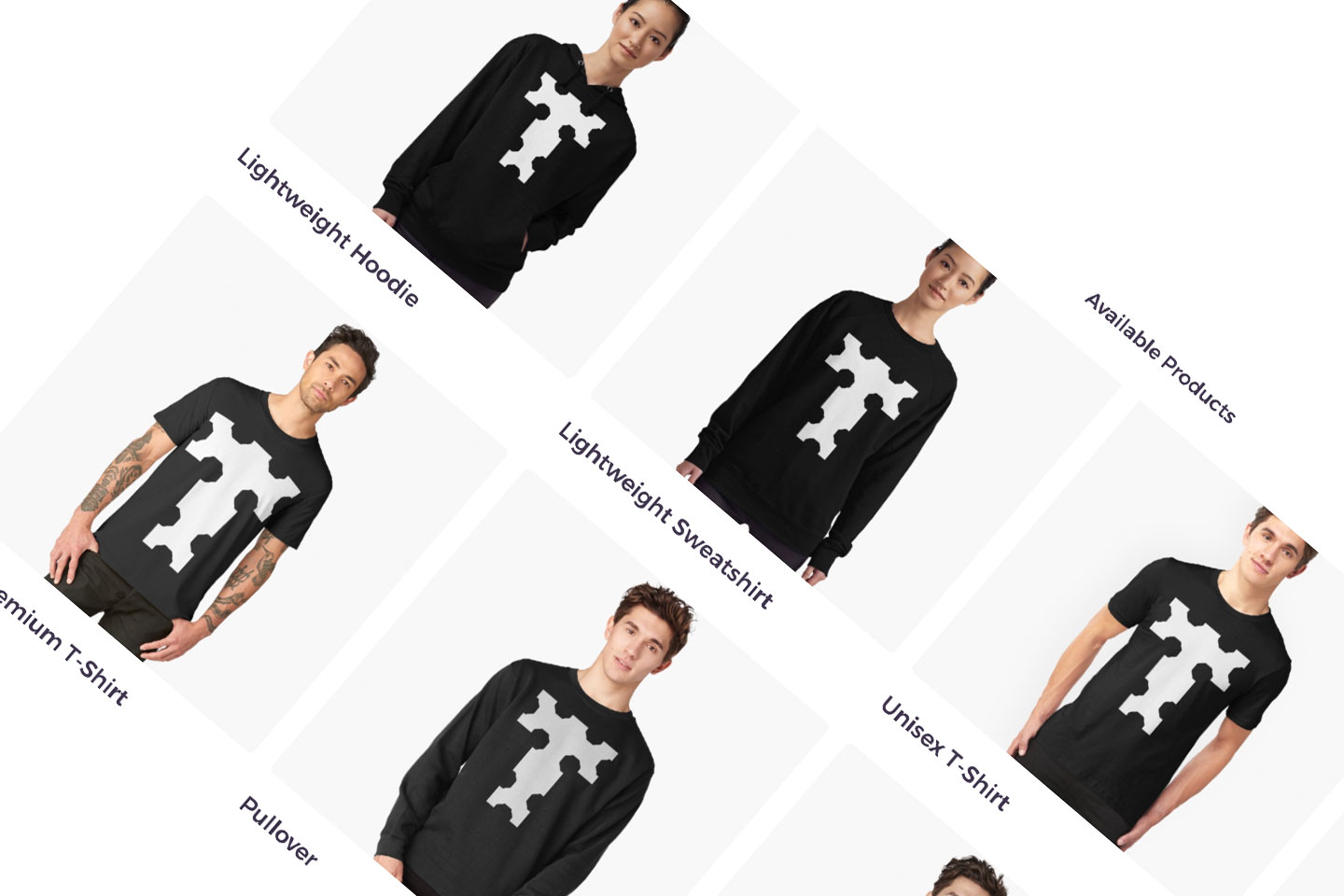
At Redbubble, like in most retail, one of the most valuable sales mechanisms is the addition of new products to the range. My role required delivering dozens of products into the marketplace, and to work with my team to extract maximum value from that process.
The company was going through a tough growth phase, struggling with software architecture straining under the volume of transactions and content on the site. Adding new products was increasingly risky and the Marketplace team were deep into rewriting core parts of the system while continuing to launch new products.

Issues
Historically when launching new products in the marketplace the entire database of millions of designs in the system were programmatically applied (or “migrated”) to the new product to populate the catalogue of (virtual) products.
The first few days in a product launch are critical to sales and migrated catalogue pages were sub-standard as many designs just weren’t suitable for the new product (eg. a repeating pattern is odd on a tee).
The net impacts were underwhelming product launches, missed sales, poor customer satisfaction, and disappointment for artists, as well as significant pain for developers managing the migration. This process was costly on many fronts and needed to be improved.
Strategy
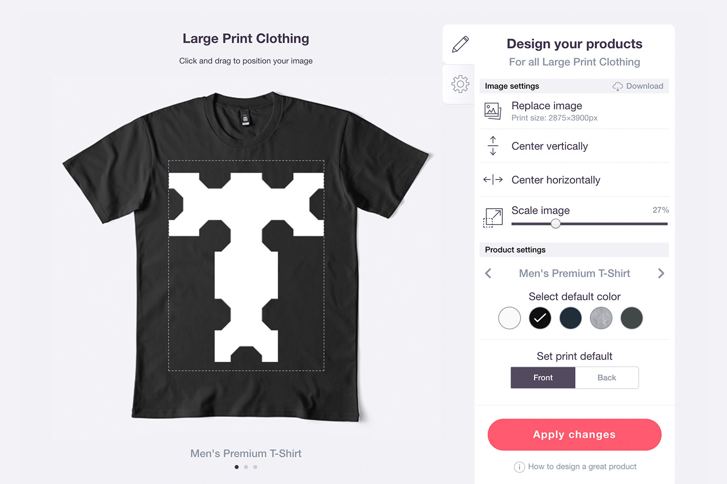
Qualitive research we’d gathered from the artist community pointed to a solution: stage the release of products into the marketplace. From pre-release through to launch, artists should be given an opportunity to customise designs for new product before it went live to consumers.

Working with the team’s BA I set about defining how that experience would work for artists and consumers, and what was required to make it happen.
After months of work from the team we launched our first staged product using the new approach and were able to celebrate better SRPs, better sales, and higher artist satisfaction. Also, with and de-risked product launches developers were freed up to work on improving the platform.
Opportunities
With improved product launches came greater opportunities to optimise the experience for artists and customers. Through my user interviews and some A/B testing we identified that the most valuable thing we could do was improve both the quality and number of images of for all products.
From there I sought understanding of what customers wanted from product images through a combination of market research (provided by the product team) and user interviews. Based on what we learned I co-created photography briefs with the product team — specifying product angles, details, and special requirements for shots. I then attended photo shoots playing the role of art director and technical advisor.
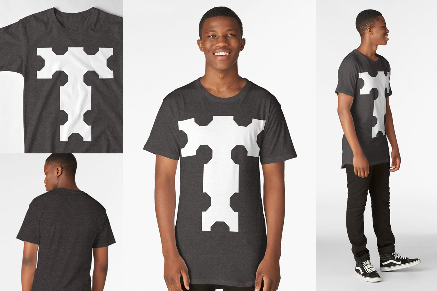
A significant Redbubble innovation was the use of 3D image mapping mixed with photography to produce very realistic looking product previews. While developers worked on the tech to increase the volume of previews the system could handle I worked with an imaging expert to improve the preview production pipeline and process (as well as getting on the tools to develop the complex preview assets).

Using this new process we were able to consistently launch 12 products a year on average (a notable increase from previous), and deliver with overall higher quality and volume. This resulted in more successful product launches and more high-performing products in general.